Colors
We stick to the color palette provided by TailwindCSS, and don't define our own RGB values.
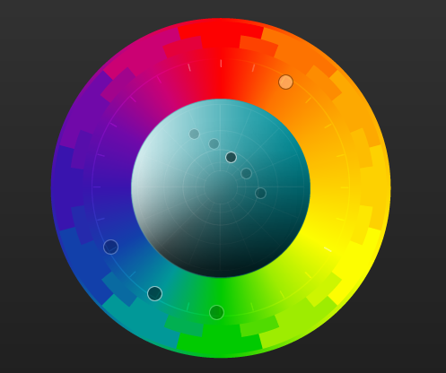
Within that framework, we stick to three adjacent colors on a color wheel (blue, teal, and lime) and one complementary color (orange). We use slate when a neutral color is required. Any of the values (50-900) can be used within those colors.
Basic rules
These could be subject to change as we learn more about what works well and looks good.
- Use
bluefor primary and call-to-action interactive elements (like buttons). - Use
tealfor primary non-interactive elements (like cards). - Use
limefor indications of "success" or interactive elements that indicate positive intent. - Use
orange(especially darker shades) for "warning" or "danger" elements (buttons, errors). - Use
slatefor things that shouldn't draw any particular attention (e.g. background and regular text).
On a color wheel
While it doesn't exactly match the Tailwind colors, you can use paletton.com to see a good visualization of how our colorscheme looks on the color wheel: